This is a horrible question to ask an artist, or, in this case, a designer. When asked what her favorite color is though, Karina Higginbotham gave the story of how her favorite color came to be just that: her favorite.
Here's a video of Karina giving us a shortened version of her story:
Tuesday, May 4, 2010
Looking for a little inspiration?
Here's a map of a few locations in Cleveland, Ohio that would melt any artistic brain freeze. Some of these locations would be great to use as a photography site and others can simply be used for whatever your imagination allows. Especially beautiful are the abundance of parks and gardens in Cleveland. Most people wouldn't name Cleveland as a prime location for this sort of thing, but it's true. Take a look for yourself:
View Locations in Cleveland in a larger map
Note: Some locations deviate from the rest of the markers a bit. You may want to take a look at the larger map for a better view.
View Locations in Cleveland in a larger map
Note: Some locations deviate from the rest of the markers a bit. You may want to take a look at the larger map for a better view.
Monday, April 26, 2010
Be right back!
Due to a tech difficulty (thanks blogspot) some of my posts said bye for a while. Everything has been sorted out for the most part and my updates will be available shortly. There may be a new look as well, you'll just have to wait and see.
Friday, April 16, 2010
Aesthetically Pleasing: Questions on Design

If you’re familiar with the tech world, you probably know about the recent “4G” iPhone leak. One of the most obvious things about the purported device is a major design overhaul, including a smaller design. If this is truly the next generation iPhone the design change makes a lot of sense when compared to its other i(InsertNameHere) counterparts.

gizmodo.com
For the past couple of years Apple Inc. has been producing many of products with a distinctive black and silver flair. Coupled with its newest addition, the iPad, having a nearly identical design scheme as the iPhone, it was only a matter of time before Apple cranked out a design upgrade.
Now, we’re not sure if this will be what the next iPhone will look like, but that doesn’t negate the fact that the prototype looks quite nice. Apple is known for its “flashy” products, but underneath the glitz is truly reliable hardware, relatively speaking. Sure, other companies have equally or possibly even better hardware than Apple, but it’s probably ugly not as aesthetically pleasing to consumers.
While perusing CNET.com, it seemed as though many users have a chip on their shoulder about the success of Apple with some saying their products are merely a cute paperweight. Considering Apple products sell and are functional isn’t a secret it’s obviously a moot opinion, but it does raise questions about great looking products.
Simply put, a Ford runs and a Lamborghini does as well, but if given the choice, which would, most people choose.
Bingo.
So, how important is aesthetics relative to functionality? Does it truly matter? Artistically speaking, looking nice is never a bad thing.
Tuesday, April 13, 2010
Wallpaper.

Aimee Wilder "Analog Nights" Wallpaper
Yes. Wallpaper.
What about it again?
Forget Louis Vuitton, some of the best designs around can be found on wallpaper, and not just the kind you use on your MySpace (that is, if you still use MySpace). This wallpaper is the traditional kind you soak and plaster onto walls. Regular old paint still seems to be the go to for adding personality to a room, but that doesn’t mean wallpaper has died. It just needs reviving.
Not too sure how many wallpaper artists there are out there, but one thing’s for sure: they exist and they’re not going away any time soon. This is a good thing, especially when you consider websites like this one:
It features custom made, COOL looking wallpaper. Not the kind we often think of in movie with throwbacks from the 70s, but the kind that’s functional and can really add to a living space.

from decoratetoday
Saturday, April 10, 2010
Class Story: Watercolorist

Patricia Harper says she doesn’t know where she got her talent. One day she started drawing and never quit.
“I don’t remember my first drawing or painting, I only remember spending all of my time with a pencil or brush in my hand when I was a kid,” she said.
Harper is a watercolor painter from Port of Spain, Trinidad, a Caribbean island off the coast of Venezuela. She says as a young child the island itself encouraged her to keep drawing and painting, as there was always something new to find.
“Sometimes, especially during the summer, the sky or the water would look different every day for a week,” she said.
Harper came to the United States with her parents and five older siblings in the 1970s. Though she did not have the same inspirations as she did in the sometimes-cold northeast Ohio, being the youngest meant she had a lot of time on her hands.
“Everyone else is older than me by some years, so I always had to find something to do on my own,” she said, “East Cleveland wasn’t as exciting as home, but when you’re a bored kid you have to make the most of it.”
Harper is now in her 50s and creates more work than ever before. She currently resides in East Cleveland, Ohio, where she takes artwork commissions aside from being a registered nurse. Most of her work is in the form of paintings, but she says she still receives commissions to create colored pencil or charcoal pieces as well.
Her career in the medical field has been especially beneficial for her commissioned work. She says two patients’ families have requested paintings of their loved ones and she is happy to oblige.
“I just really enjoy making people smile with my work, especially for the families since they sometimes don’t have much to look forward to,” she said.
Beginning this year, Harper says she plans to start entering her work into exhibits and galleries once again. She says working full time on with a typical nurse’s hours per week has kept her from doing so for the last 15 years. Even before then, her participation in these galleries was only a few a year compared to the handful or more she would do in years past.
Aside from returning to the art scene, Harper says she is also excited to begin creating artwork in other media. She says watercolor will always be her medium of choice, but the popularity of digital work has sparked her interest in recent years. Her oldest son, Tyler, is a graphic artist and opened his studio to her to begin making moves in the digital realm last spring. Now, a year later, he says she may be ready to even take on clients if time permits.
“She learns quickly, but then again I learned everything I know from my mother anyway,” he said.
Harper plans to show off her latest work at the Hester Street Fair this summer in East Cleveland, Ohio. She plans to bring a wide array of her work and will have several pieces up for sale as well.
Monday, April 5, 2010
Guess Who (or What) is Back? You Guessed It: Traditional Animation

Disney recently released “The Princess and the Frog” to DVD and it's exciting on many different levels. Despite this being Disney’s first adventure with a black princess, it’s also its first whirl with a majority traditional animation in a while. With the advent of computer technology and such, we’ve begun to see much more computer-generated work being released. There is nothing particularly “wrong” with this, but for the generations accustomed to Disney’s classic side, this is a breath of fresh air.
Much work and preparation goes into creating a hand drawn feature length movie, and with the market for CG (computer generated) movies on the rise in the late 90s, Disney made the switch. Much of this had financial implications of course (Dreamworks and Pixar were blowing Disney out of the water once upon a time, and with no pun intended), but now that they are out of the water it must have felt like the a good time to release a traditionally animated film. That, and many people may not go for a princess classic in CG. You never truly know, really.
Anyway, technically speaking “The Princess and the Frog” is an awesome movie visually. It had the characteristic colorful musical numbers present in nearly all musical numbers, but being set in New Orleans the directors likely knew they would have to put a lot of focus on Cajun and New Orleans culture. If you’ve ever been to New Orleans, you would see how good a job the illustrators on this project did to artistically preserve it the movie. You can even see this by checking out the movie's website.
Now, will traditional animation stay awhile? Probably not, but that's okay. It's great to see good films in traditional animation can still do fairly well against its late 21st century counterparts.
Wednesday, March 31, 2010
Daniel "Diggy" Simmons: He Puts the "Esh" in "Fresh"

Sure, the kid may be rich and all, but that has nothing to do with the fact that he has a sense of style.
Diggy Simmons has his own fashion/design and music blog over at DigsLifeoftheJetSetter.blogspot.com and it’s a must read. He recently gave a sneak peak of some of the designs of his soon to be released shoe line call Chivalrous Culture and has already created a buzz on the fashion scene with his updates of self put together outfits. Even though he has much more money than the rest of us, he is definitely cognizant of this and doesn’t go too overboard with most of his favorite fits. When he does splurge he’s also sure to point readers to a cheaper alternative.
Cool kid.
As for his shoe line again, Diggy not only disclosed his first design but also introduced several color ways as well. If you’re unfamiliar with the fashion industry, specifically the facet involving shoes, color ways are important. As with the “Yellow” and “Purple” posts, colors can make or break a painting. Either way, color adds personality, and Diggy’s new line of shoes has just that.
Here is his first color way:

The next one:

Finally, the third:

Monday, March 29, 2010
A Girl's Best Friend
Shoes.
This post could be finished with just that word above!
A while back in the slideshow post, all the shoes featured where of the male variety. Now it's time for the ladies to shine as well. The following shoe color ways are not only perfect to wear, but would make an awesome palette for a painting. So, here we go:
Our friends over at the online mag SneakerFreaker.com don’t disappoint when it comes to women’s sneakers. The great thing about women’s shoes is the interesting color ways. Men shoes have super cool color ways as well, but it seems as though many designers feel freer with designs when it comes to women’s shoes.
First up is the Adidas Attitude Hi:

Adidas is going for a purple/violet, gray and white color way that would also look perfect on a sunset or sunrise painting. The pinstripe design makes the shoe stand out without making it too overbearing with the darker shades.
Next is the Women’s Air Jordan Spiz’ke
The color way used here is reminiscent of a candy store, which itself is quite the best emporium of color variety besides nature itself:

I admit, these shoes are well within the realm of a unisex style and it shouldn’t be surprising to find a guy wearing these. However the mix of texture and colors are unique. Its old school flair is bound to make it one popular pair of kicks.
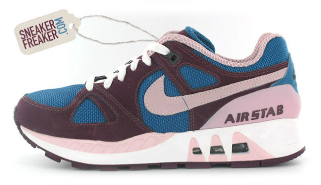
Now on to the Nike Air Stabs. Besides its unsettling name, it has many really cool color ways that would look great on a canvas somewhere (or maybe even on your wall).


Last but certainly not least is the DC Manteca X Miami Ink:


Besides being a crazy plethora of color, the DC Manteca is also a mish mash of texture and original artwork by Miami Ink tattoo artist Darren Brass.
So there you have it: cool color ways in (almost) exclusively women’s styles. Check out SneakerFreaker.com for more colorful mixes.
Friday, March 26, 2010
In need of a vacay? Let's Go to Ghana!

Xinhua/Reuters Photo
Ghana is a country in western Africa with many cool sites to see. Any respectable artist should want to visit any country on the continent, as its rich with interesting people and places.
Ghana was formerly an empire before being taken over by the British, and then the free Republic of Ghana was formed in 1960. Since 1890, however, the Aburi Botanic Gardens have been in operation. It looks over the Accra coastal plain, and due to Ghana’s climate, is open year-round. There are hundreds of species of plants and wildlife here and is a favorite spot for artists.
One of the most well known vegetation in the Gardens in the Silk cotton tree, which can be easily spotted by their height. A forest of these trees once rested in this spot, but now the area is filled with much more variety. Even so, that doesn’t keep the trees from being one of the most popular spots in the Gardens. The tree is one of the tallest in western Africa, easily reaching 130 feet high or more. The wood of the tree is often used to make household items, and the seed oil and kapok (interior) has several uses ranging from cooking to a substitute for wool.
.jpg)

Tuesday, March 23, 2010
Super Cool: Ross Oscar Knight

Photography literally means to draw with light, and this is exactly what photographer Ross Oscar Knight does.
Knight is a Florida native who says he’s had a passion for photography since he was a little boy. He would even secretly take pictures of family members around the house and eagerly wait to get them developed. His passion didn’t immediately transform into a career though--Knight obtained a degree in engineering before picking up the camera again.
Nowadays, Knight is one of the most sought after wedding photographers in the country. The way he draws with light was first noticed only about five or six years ago, and since then he has traveled nationally and globally to capture memories with his camera.
One of Knight’s most interesting uses of his camera doesn’t necessarily have to do with his camera per se, but with the sun. Here he talks about how he waited for the right moment of the day to begin shooting. Even when he doesn’t quite get the lighting he likes, he improvises in other ways.
Knight uses bokeh, or the blur of out of focus images, very well in his photographs. If done correctly, you get a Monet-like effect. Using bokeh also helps draw attention to the subject, who, using the correct setting, would look like they are being photographed against a painted-like background.
Here is a little of Knight's photography. If you like what he does and want to book him, you may have to stand in line for a while, which is fine, since you may need to take some time to save up for his services. As you can see, it would be well worth the cost:
Some of Ross's awesome work
Thursday, March 18, 2010
The Boondocks

Aaron McGruder is the creator of one the most thought provoking comic strips around: The Boondocks. The comic itself was started when McGruder was an undergrad at the University of Maryland. It quickly gained popularity and eventually ran in syndication in several newspapers. The comic strip turned television show features the daily adventures of brothers Riley and Huey, kids who talk as if they are 20 or so years older than 8 and 10 years old. The brothers live with Granddad, have neighbors Tom and Sarah and their daughter Jazmine, Uncle Ruckus and others.
McGruder uses the strip in a comical way to talk about serious issues, namely racism, prejudice and the everyday life of its characters of which most are black. Huey (named after Black Panther Huey Newton and his little brother Riley) regularly cuss and spit knowledge that often takes Granddad for a surprise. They are also knowledgeable of how their society works relative to skin color and find themselves in some ridiculous problem trying to solve it.
The show version of the comic is drawn in anime/manga-style and sent to a studio in South Korea for its final phase of development. When it was created, The Boondocks was the only anime-style show to feature a predominantly black cast, voice actors included. Characters drawn in anime or manga style usually have exaggerated features, and the term “anime” itself has come to mean animation in Japanese.
The comic is now in its last season which begins in May, meaning with it goes the first (okay, one of the first) black anime/manga show to become widely popular. In honor of its retirement, here's a video clip of one of the episodes:
Monday, March 15, 2010
Yellow.

A primary color, yellow is also one of the most widely used colors on a palette. Because it can be used to create several different colors--orange when mixed with red, green when mixed with blue and so on--it's nearly as versatile as white or black. Yellow's complementary color is purple/violet.


On the word "yellow", per wikipedia:
"The word yellow comes from the Old English geolu, or geolwe which derived from the Proto-Germanic word gelwaz. The oldest known use of this word in English is in the Old English poem Beowulf, in a description of a shield made of wood from a yew tree."
Yellow is a warm color, though it is often used to evoke a sense of warning (along with the colors electric green or red in some instances), even in nature. Traditionally it has also been used in the form of a yellow ribbon to welcome military men and women home, contrary to its slang use to mean someone cowardly. It is also a color representing peace in India and courage in Japan. In parts of Europe it can be used to represent sadness, or love.
In spite of all the uses for yellow, it being a bright, warm color is what makes it stand out most. Adding this color to a generally neutral palatte of browns, grays and black changes it dramatically, even drawing attention away from the other colors in some cases.
British alternative rock band Coldplay used the color yellow to “paint” the song below:
Thursday, March 4, 2010
Flesh tones

Creating flesh tones is difficult, especially for people of color.
Most flesh tone tutorials or other resources relating to flesh tones simply look off. It is difficult to get a wide range of colors the first time mixing them (or even the second and third).
Damali Ayo took on the challenge of creating flesh tone colors.
The trick to creating flesh tone colors is to limit yourself concerning colors. Even green can be used to create a desired tone. Of course, there is no specific color for combination of colors for a skin tone. Even so, there can be some general rules to follow when it comes to skin tones. Courtesy of painter Monique Simoneau, here are some good rules of thumb when creating skin colors:
1. Titanium white
2. Cadmium Red Light
3. Cadmium Yellow Medium
4. Yellow Ochre
5. Burnt Sienna
6. Burnt Umber
7. Ultramarine Blue.
For light flesh tones use colors 1, 2, 3, and 5.
For medium flesh tones use 2, 3, 4 and 5.
For dark flesh tones use 2, 5, 6 and 7.
As you can see with the darkest flesh tone, both ultramarine blue and cadmium red light are mixed on/in the same palate. Interestingly, a non-spectral violet (purple) is similarly used to create evening skies and other darker elements. This then makes perfect sense to see how purple is created and used to to create flesh tones.
Saturday, February 27, 2010
Kicks and Colors
Shoes have some of the best color palettes. Since the beginnings of hip hop culture image has been everything, and if you're shoes were "whack" you didn't get any respect. None.
Here are three great color palette examples courtesy of SneakerFreaker.com. A slide show* of sites around inner city, downtown and Coventry in Cleveland is at the bottom. As many artists who have gotten into the shoe designing businesses are either from or familiar with the inner city, it's easy to see how sites like these in any city could have been inspiration. In fact shoe number two is even a little reminiscent of graffiti, circa 1988.
First up: Lacoste
 Colors: chocolate, brown, caramel and a hint of beige.
No. 2: Nike Dunks
 Colors: Plum, purple, pale yellow, black, red, aqua, white
Tres: Adidas Rainbow Wings

Colors: Black, electric pink, yellow, cool blue, green and purple.
Now for the slide show. If you've ever been to the inner city, then you'd see how coming up with various color palettes for show designs (or, any design for that matter) isn't a problem. Those artists in the inner city can step outside for instant inspiration.


*Note: slide show photos were taken by myself. If you'd like to use them, just ask!
Here are three great color palette examples courtesy of SneakerFreaker.com. A slide show* of sites around inner city, downtown and Coventry in Cleveland is at the bottom. As many artists who have gotten into the shoe designing businesses are either from or familiar with the inner city, it's easy to see how sites like these in any city could have been inspiration. In fact shoe number two is even a little reminiscent of graffiti, circa 1988.
First up: Lacoste
No. 2: Nike Dunks
Tres: Adidas Rainbow Wings
Colors: Black, electric pink, yellow, cool blue, green and purple.
Now for the slide show. If you've ever been to the inner city, then you'd see how coming up with various color palettes for show designs (or, any design for that matter) isn't a problem. Those artists in the inner city can step outside for instant inspiration.
*Note: slide show photos were taken by myself. If you'd like to use them, just ask!
Monday, February 22, 2010
Purple! (or violet)
You know you're a big deal when you have your own domain name...and you're a COLOR.
That's right, purple has it's own domain: www.purple.com.
On the color purple (non-spectral)/violet (spectral), Wikipedia of all places has some insightful info:
"The word 'purple' comes from the Old English word purpul which originates from the Latin purpura. This in turn is derived from the Koine Greek πορφύρα (porphyra), name of the Tyrian purple dye manufactured in classical antiquity from a mucus secreted by the spiny dye-murex snail.[5]
The first recorded use of the word 'purple' in English was in the year A.D. 975."
Purple/violet is a popular color to use as a dark hue in lieu of black. It can also be mixed with black to create a dark, rich indigo to be used in creating a night sky. It is also a valuable color in underpainting for paintings with lighter colors (yellow, beige, tan, ect...) since its complementary color is yellow.
Purple/violet is also a very versatile color due to its parent colors: red and blue. This is particularly true for purple and not violet, as violet is spectral and isn't created by any other colors. Purple can have an increased amount of red added for a warmer plum color. It can also be cooled down with extra blue. A rich purple with a balance of red and blue can have very masculine, royal connotations, whereas the much lighter lavender is often considered to be on the feminine side. As such, purple can be used in several ways in a single painting.
Here is an example of a very purple painting using a wide array of hues:

Wednesday, February 17, 2010
Art & Haiti

Of course, supplies of any kind are limited. The article touches on this, and it certainly includes art supplies. It will be interesting to see how many possibly end up dabbling in homemade pigments. One of the biggest hurdles they will have to face will be jump starting their economy again. Haiti did not have much of an economy when the quake hit, but one can expect these works of art to be a great addition to the market. It is also a way for those outside of the country to experience the gravity of their situation.
One of the biggest positives in all of this is probably the history recording. If you've been following any sort of news concerning Haiti, just about everything is demolished. Though there are too many concerned with preserving history and culture at this point (which makes sense, they're very much still in emergency mode), for the time being paintings like these offer the vivid details of all that's happened since January 12. Haiti is a ways off from entering current events into textbooks and such down there.
As an aside, musicians in Haiti aren't fairing so well as many of them lost their instruments (info I've gotten from friends on the ground). Hopefully they will soon be playing again. Much of 2D and 3D art is influenced by and influences music.
First things first though! Rebuilding will take a while, though I'm excited to see artists get back to work.
Friday, February 12, 2010
Virtual 20 North Gallery = DOPENESS!!
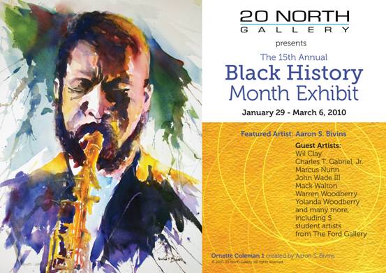
Found this site by accident while looking around 13abc.com. I haven't been to an art gallery in a long time and found this one, 20 North Gallery, in Toledo. Since everyone is not from Toledo, or even Ohio for that matter, the gallery has provided a new way to show wishful patrons what they would have seen if they'd been able to make it to the gallery. The gallery created a virtual tour of their 15th Annual Black History Month exhibit.
Now, the virtual tour can be a bit tricky to use. If this is the case for you, they also have a set of photos of the gallery. If it still doesn't work out for you there are directions to the gallery on the website. The gallery closes March 6.
The watercolor painting above was created by featured artist Aaron S. Bivens. He is a member of the Ohio Watercolor Society and the Toledo Artists Club. He has six works in the gallery. Many other works were created by area artists and students.
Wednesday, February 10, 2010
Corey Barksdale, Atlanta - Mural Painting
Corey Barksdale of Atlanta painted this mural using acrylic--basically super fast, as acrylic dries in a heartbeat. Check him out:
love, peace & gesso,
Bliss
love, peace & gesso,
Bliss
Monday, February 8, 2010
Etsy and Marcus Kwame.
Etsy has much more than clothes and furniture, it has some very talented and established artists as well.
While looking at her work this guy came up. His name is Marcus Kwame Anderson and his work is amazing. Anderson is a Jamaican artist currently residing in New York. Even without reading his bio or any photo descriptions you can easily tell one of his prime inspirations is the African Diaspora.
Here is an example of one of his prints, the original is acrylic on canvas:

Acrylic is one tough medium to deal with, which makes the piece even more amazing. Acrylic is very versatile in that it can have a consistency anywhere from thick oil paint to thinned out watercolor, but dries very quickly. It's its fast drying qualities that make it difficult to work with at times, but Kwame has obviously mastered this obstacle. This piece also makes up of various strokes and simply laying on the paint for an oil painting feel.
It's good to see an artist with Kwame's talent on Etsy. Etsy has a host of not-so-known artists on its site and would be a great place for any artist or designer to begin marketing themselves. There are also groups of artists who know one another through Etsy, but use their own organization for visibility. One such group is the EAOC, or the Etsy Artists of Color.
Be sure to look at Marcus' Etsy and professional site for more examples of his work. If you're disappointed, you may need to invest in glasses.
Sunday, February 7, 2010
Say Hello To: Stephen Wiltshire

Wiltshire is selling PRINTS of his work for more than $1,000. Dude is the real deal! Most original works go for the prices he's selling his prints, which should tell you about the talent this guy has. Steven is an illustrator first and just about everything else second, but his second is still priceless as well. He captures texture and color in his colored drawings flawlessly as well.
A little background info on Stephen, courtesy of Stephen Wiltshire.co.uk:
"Stephen Wiltshire is an artist who draws and paints detailed cityscapes. He has a particular talent for drawing lifelike, accurate representations of cities, sometimes after having only observed them briefly. He was awarded an MBE for services to the art world in 2006. He studied Fine Art at City & Guilds Art College. His work is popular all over the world, and is held in a number of important collections."
Stephen was diagnosed with autism when he was three and later used drawing to help identify with the world around him. He currently has hundreds of pieces in his online gallery, as well as a host of videos and other materials about what he does. One video in particular details his amazing photographic memory capabilities. Hopefully his book "Drawings" will be back in stock soon, it's definitely something you'd want in your art book collection.
Hi there :)
Welcome to my newest blog, The Black Paint. I have a few couple few other blogs that should be appearing in my blog roll one day, lol.
Anyhoo, this blog is part of a class assignment for my online journalism course. Since this contents of this blog will be stuff that actually kinda pertains to me beyond getting an "A" in the class, I may or may not continue it come May (graduation!).
For now feel free to look around. I have more extensive info about this place in the About section above and in my profile.
Thanks for stopping by :).
Love, peace & gesso
~Bliss
Subscribe to:
Posts (Atom)