Wednesday, March 31, 2010

Daniel "Diggy" Simmons: He Puts the "Esh" in "Fresh"


Sure, the kid may be rich and all, but that has nothing to do with the fact that he has a sense of style.

Diggy Simmons has his own fashion/design and music blog over at DigsLifeoftheJetSetter.blogspot.com and it’s a must read. He recently gave a sneak peak of some of the designs of his soon to be released shoe line call Chivalrous Culture and has already created a buzz on the fashion scene with his updates of self put together outfits. Even though he has much more money than the rest of us, he is definitely cognizant of this and doesn’t go too overboard with most of his favorite fits. When he does splurge he’s also sure to point readers to a cheaper alternative.

Cool kid.

As for his shoe line again, Diggy not only disclosed his first design but also introduced several color ways as well. If you’re unfamiliar with the fashion industry, specifically the facet involving shoes, color ways are important. As with the “Yellow” and “Purple” posts, colors can make or break a painting. Either way, color adds personality, and Diggy’s new line of shoes has just that.

Here is his first color way:


The next one: 

Finally, the third


It looks like the third one might end up being a favorite. It’s very clean looking and comes in one color (though, admittedly, white isn’t technically a color), but that’s also what makes a great shoe. Diggy and the faithful followers who intend to cop these will give Nike and other shoe giants a run for their money with these.

Monday, March 29, 2010

A Girl's Best Friend

Shoes.

This post could be finished with just that word above!

A while back in the slideshow post, all the shoes featured where of the male variety. Now it's time for the ladies to shine as well. The following shoe color ways are not only perfect to wear, but would make an awesome palette for a painting. So, here we go:


Our friends over at the online mag SneakerFreaker.com don’t disappoint when it comes to women’s sneakers. The great thing about women’s shoes is the interesting color ways. Men shoes have super cool color ways as well, but it seems as though many designers feel freer with designs when it comes to women’s shoes.

First up is the Adidas Attitude Hi:

Adidas is going for a purple/violet, gray and white color way that would also look perfect on a sunset or sunrise painting. The pinstripe design makes the shoe stand out without making it too overbearing with the darker shades.

Next is the Women’s Air Jordan Spiz’ke

The color way used here is reminiscent of a candy store, which itself is quite the best emporium of color variety besides nature itself:

I admit, these shoes are well within the realm of a unisex style and it shouldn’t be surprising to find a guy wearing these. However the mix of texture and colors are unique. Its old school flair is bound to make it one popular pair of kicks.

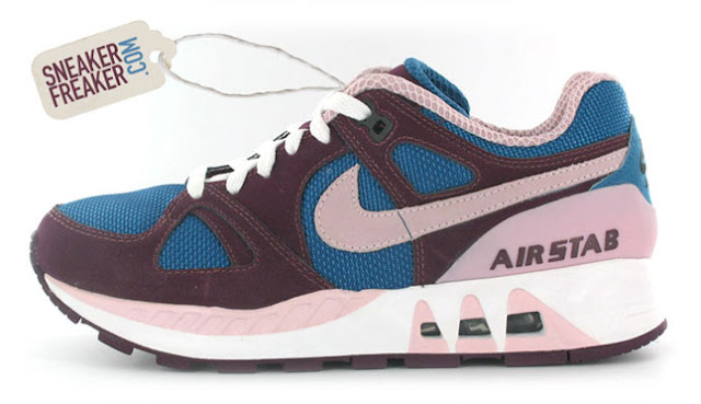
Now on to the Nike Air Stabs. Besides its unsettling name, it has many really cool color ways that would look great on a canvas somewhere (or maybe even on your wall).


Last but certainly not least is the DC Manteca X Miami Ink:


Besides being a crazy plethora of color, the DC Manteca is also a mish mash of texture and original artwork by Miami Ink tattoo artist Darren Brass.
  
So there you have it: cool color ways in (almost) exclusively women’s styles. Check out SneakerFreaker.com for more colorful mixes.


Friday, March 26, 2010

In need of a vacay? Let's Go to Ghana!


Xinhua/Reuters Photo

Ghana is a country in western Africa with many cool sites to see. Any respectable artist should want to visit any country on the continent, as its rich with interesting people and places.

Ghana was formerly an empire before being taken over by the British, and then the free Republic of Ghana was formed in 1960. Since 1890, however, the Aburi Botanic Gardens have been in operation. It looks over the Accra coastal plain, and due to Ghana’s climate, is open year-round. There are hundreds of species of plants and wildlife here and is a favorite spot for artists.

One of the most well known vegetation in the Gardens in the Silk cotton tree, which can be easily spotted by their height. A forest of these trees once rested in this spot, but now the area is filled with much more variety. Even so, that doesn’t keep the trees from being one of the most popular spots in the Gardens. The tree is one of the tallest in western Africa, easily reaching 130 feet high or more. The wood of the tree is often used to make household items, and the seed oil and kapok (interior) has several uses ranging from cooking to a substitute for wool.


Besides being a beautiful tree, the Silk cotton tree is considered sacred. Now, there is nothing particularly special about the trees coloring, which makes it a prime subject for surrealism. Given its importance, it would be interesting to see what someone could come up with when given a day or two to in the Gardens to themselves. The King Palm tree is another sight to see as well:


Tuesday, March 23, 2010

Super Cool: Ross Oscar Knight


Photography literally means to draw with light, and this is exactly what photographer Ross Oscar Knight does.

Knight is a Florida native who says he’s had a passion for photography since he was a little boy. He would even secretly take pictures of family members around the house and eagerly wait to get them developed. His passion didn’t immediately transform into a career though--Knight obtained a degree in engineering before picking up the camera again.

Nowadays, Knight is one of the most sought after wedding photographers in the country. The way he draws with light was first noticed only about five or six years ago, and since then he has traveled nationally and globally to capture memories with his camera.

One of Knight’s most interesting uses of his camera doesn’t necessarily have to do with his camera per se, but with the sun. Here he talks about how he waited for the right moment of the day to begin shooting. Even when he doesn’t quite get the lighting he likes, he improvises in other ways.

Knight uses bokeh, or the blur of out of focus images, very well in his photographs. If done correctly, you get a Monet-like effect. Using bokeh also helps draw attention to the subject, who, using the correct setting, would look like they are being photographed against a painted-like background.


Here is a little of Knight's photography. If you like what he does and want to book him, you may have to stand in line for a while, which is fine, since you may need to take some time to save up for his services. As you can see, it would be well worth the cost:


Some of Ross's awesome work

Thursday, March 18, 2010

The Boondocks


Aaron McGruder is the creator of one the most thought provoking comic strips around: The Boondocks. The comic itself was started when McGruder was an undergrad at the University of Maryland. It quickly gained popularity and eventually ran in syndication in several newspapers. The comic strip turned television show features the daily adventures of brothers Riley and Huey, kids who talk as if they are 20 or so years older than 8 and 10 years old. The brothers live with Granddad, have neighbors Tom and Sarah and their daughter Jazmine, Uncle Ruckus and others.

McGruder uses the strip in a comical way to talk about serious issues, namely racism, prejudice and the everyday life of its characters of which most are black. Huey (named after Black Panther Huey Newton and his little brother Riley) regularly cuss and spit knowledge that often takes Granddad for a surprise. They are also knowledgeable of how their society works relative to skin color and find themselves in some ridiculous problem trying to solve it.


The show version of the comic is drawn in anime/manga-style and sent to a studio in South Korea for its final phase of development. When it was created, The Boondocks was the only anime-style show to feature a predominantly black cast, voice actors included. Characters drawn in anime or manga style usually have exaggerated features, and the term “anime” itself has come to mean animation in Japanese. 


The comic is now in its last season which begins in May, meaning with it goes the first (okay, one of the first) black anime/manga show to become widely popular. In honor of its retirement, here's a video clip of one of the episodes:


Monday, March 15, 2010

Yellow.


A primary color, yellow is also one of the most widely used colors on a palette. Because it can be used to create several different colors--orange when mixed with red, green when mixed with blue and so on--it's nearly as versatile as white or black. Yellow's complementary color is purple/violet.


On the word "yellow", per wikipedia:

"The word yellow comes from the Old English geolu, or geolwe which derived from the Proto-Germanic word gelwaz. The oldest known use of this word in English is in the Old English poem Beowulf, in a description of a shield made of wood from a yew tree."

Yellow is a warm color, though it is often used to evoke a sense of warning (along with the colors electric green or red in some instances), even in nature. Traditionally it has also been used in the form of a yellow ribbon to welcome military men and women home, contrary to its slang use to mean someone cowardly. It is also a color representing peace in India and courage in Japan. In parts of Europe it can be used to represent sadness, or love.

In spite of all the uses for yellow, it being a bright, warm color is what makes it stand out most. Adding this color to a generally neutral palatte of browns, grays and black changes it dramatically, even drawing attention away from the other colors in some cases.

British alternative rock band Coldplay used the color yellow to “paint” the song below:

Thursday, March 4, 2010

Flesh tones


Creating flesh tones is difficult, especially for people of color.

Most flesh tone tutorials or other resources relating to flesh tones simply look off. It is difficult to get a wide range of colors the first time mixing them (or even the second and third).

Damali Ayo took on the challenge of creating flesh tone colors.

The trick to creating flesh tone colors is to limit yourself concerning colors. Even green can be used to create a desired tone. Of course, there is no specific color for combination of colors for a skin tone. Even so, there can be some general rules to follow when it comes to skin tones. Courtesy of painter Monique Simoneau, here are some good rules of thumb when creating skin colors:

1. Titanium white
2. Cadmium Red Light
3. Cadmium Yellow Medium
4. Yellow Ochre
5. Burnt Sienna
6. Burnt Umber
7. Ultramarine Blue.

For light flesh tones use colors 1, 2, 3, and 5.
For medium flesh tones use 2, 3, 4 and 5.
For dark flesh tones use 2, 5, 6 and 7.

As you can see with the darkest flesh tone, both ultramarine blue and cadmium red light are mixed on/in the same palate. Interestingly, a non-spectral violet (purple) is similarly used to create evening skies and other darker elements. This then makes perfect sense to see how purple is created and used to to create flesh tones.